A Brand-New Look for the Brooklyn Museum
Meet our new visual identity.
by Sofie Andersen
September 9, 2024
At the Brooklyn Museum, we have been doing things the “Brooklyn way”—joyfully, seriously, audaciously, imperfectly, mischievously, and profoundly—for over 200 years. We never tire of celebrating the transformational power of art in all its forms with our communities.
Since 1824, our identity has evolved in trailblazing ways. We’ve metamorphosed from Brooklyn’s first free, circulating library into a bold and encyclopedic museum—the first to establish a center for feminist art. We’ve been defying convention and uplifting communities along the way, and we continue to redefine what a museum can be, look, and feel like for everyone.
This year, on the occasion of our bicentennial, we’re undergoing another evolution to help us better connect with you, our audiences, and bring us forward into the next two centuries.
Drawing from a deep reflection on the Museum’s past and present, as well as our valued visitors, our new visual identity was developed in partnership with Brooklyn-based graphic design studio Other Means. We think it captures the history, diverse perspectives, and dynamism that make the Brooklyn Museum an icon.

A brand steeped in history that helps imagine what comes next
The new visual language reflects and celebrates the past while bringing us boldly into the future. As part of their research, our creative team took a deep dive into our archives, and the Museum’s 200 years of graphic design history became a rich source of inspiration.
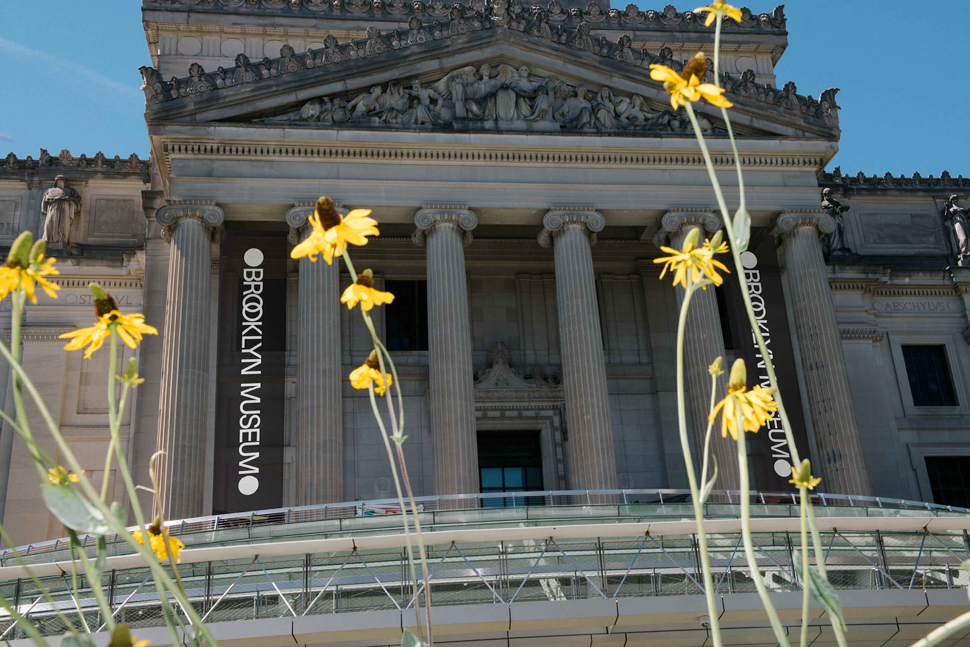
Our architectural design history also served as a wellspring of ideas. The Museum’s original neoclassical design, derived from ancient Greek and Roman architecture, was developed in the late 19th century by prominent New York architects McKim, Mead & White. The architecture itself represents an evolution: from the building’s traditional design to moves toward modernist architecture in the 1930s, to recent projects that have created more open and welcoming spaces.
The new brand draws on these elements from our past and unites them with our identity as a contemporary institution. This is accomplished through an approachable, modern sans serif typeface and ligatures that express our multidimensionality—especially within our new logo.
Encompassing a diversity of perspectives
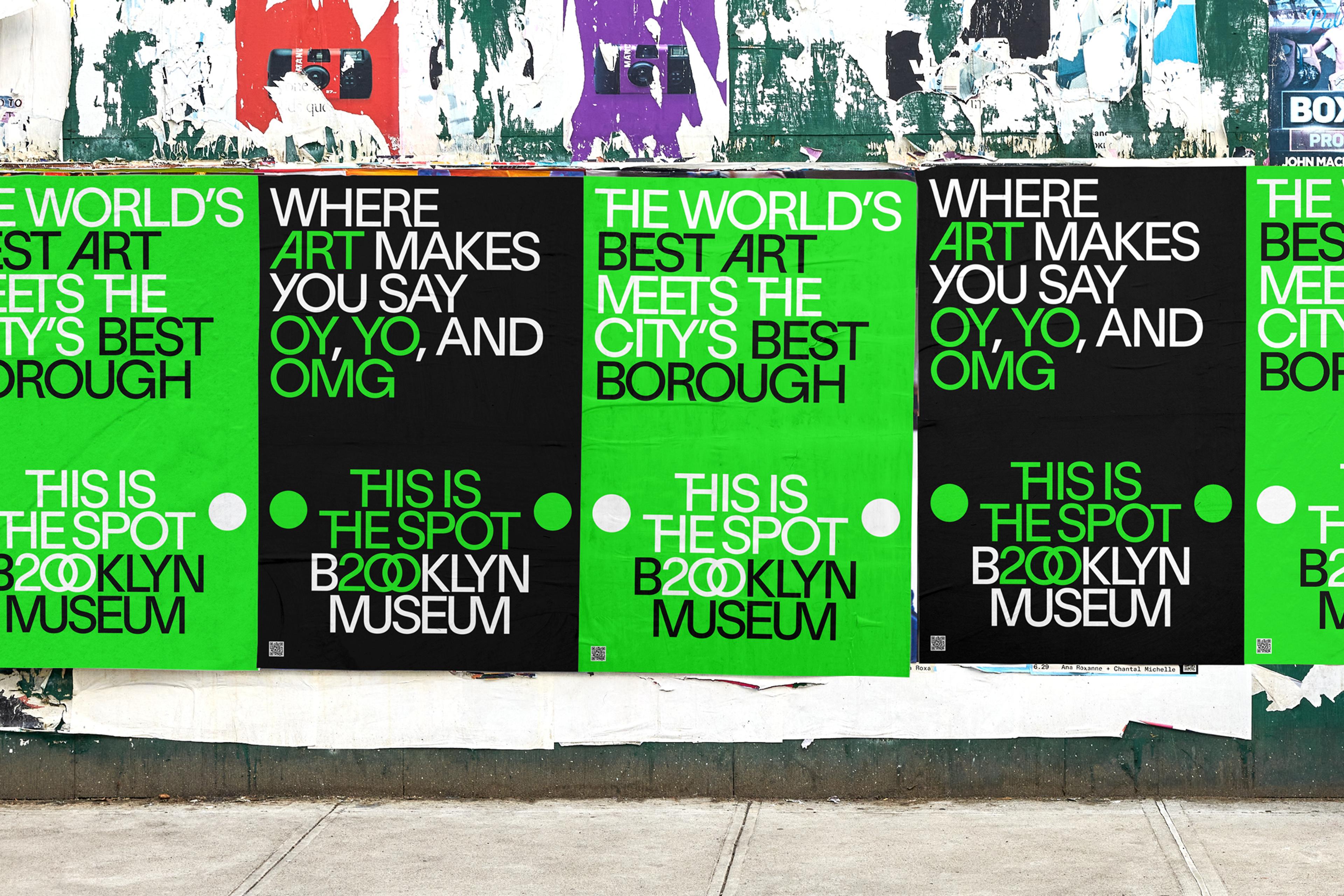
The Brooklyn Museum is globally recognized for its extensive collection and iconic building. The new logo speaks to this renown while tapping into our unique position within the borough, reflective of our dynamic, vibrant communities.
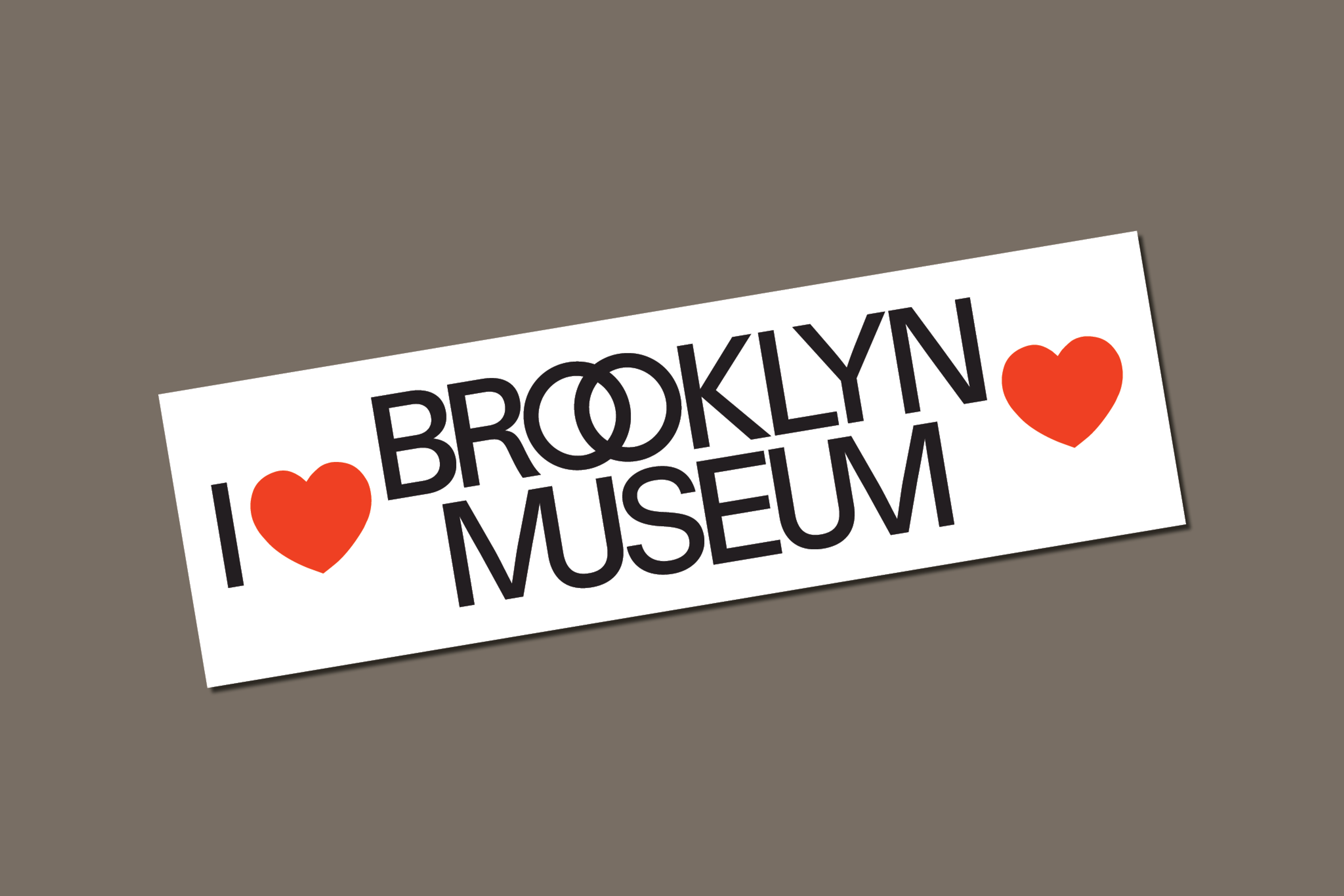
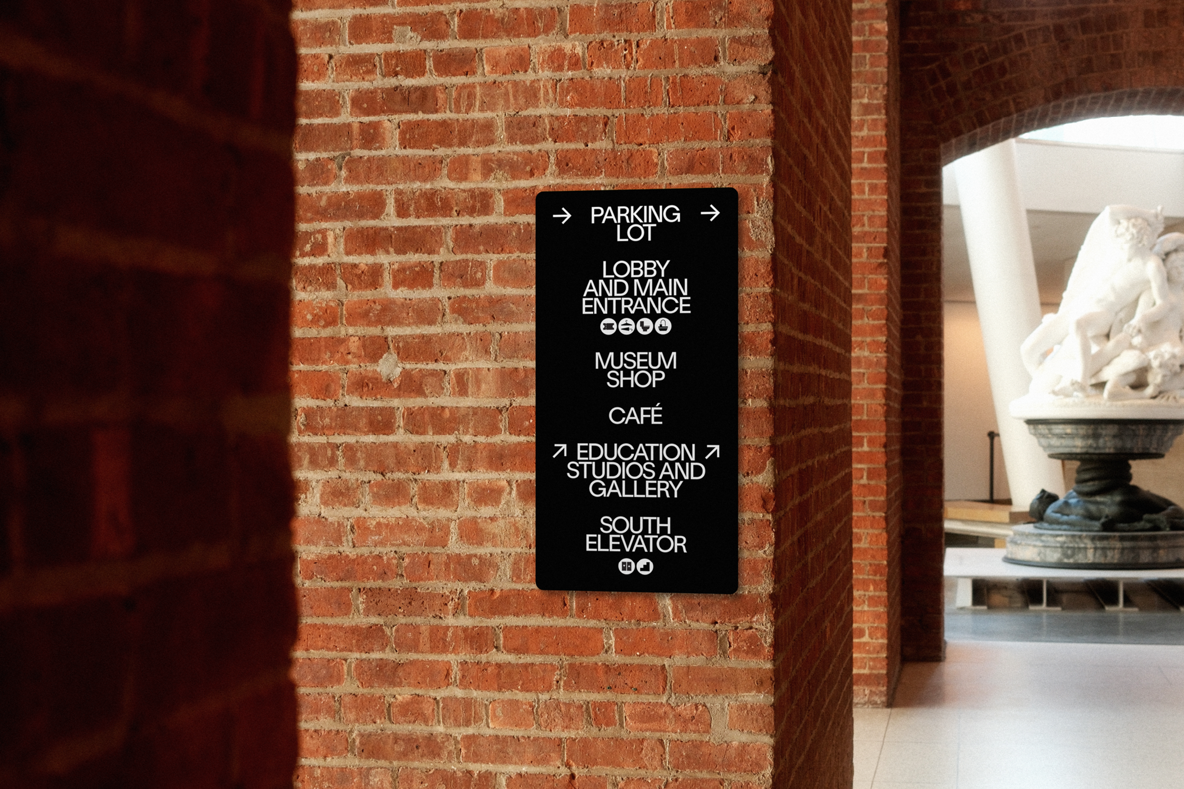
Two dots, inspired by those that frame the names of ancient philosophers, playwrights, and poets across the building’s facade, now bookend the logo and text throughout the Museum. This reference to writers and thinkers links to our beginnings as a library and to the intersectional nature of the arts.
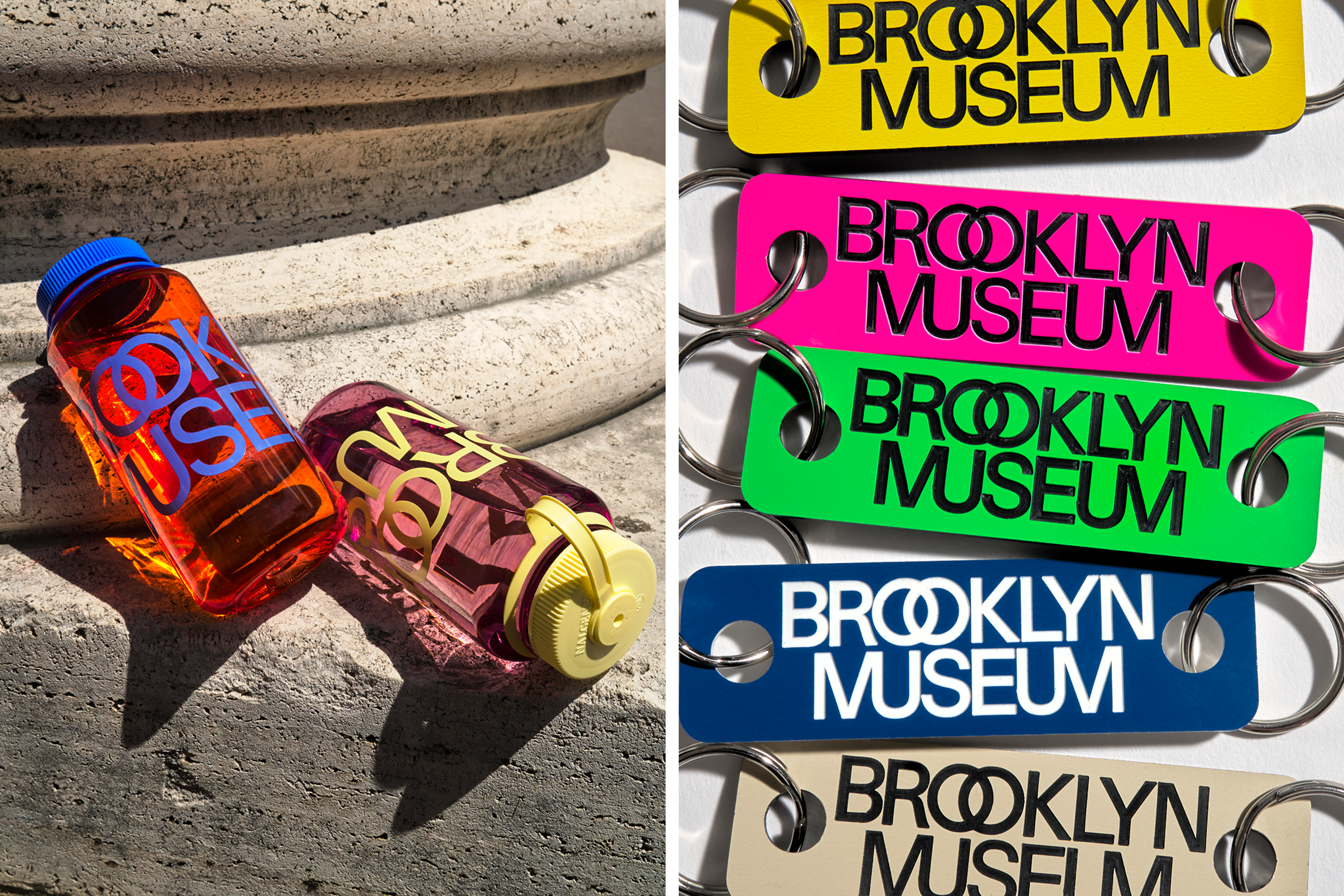
In every application, the dots appear at least twice—an echo of the two O’s in Brooklyn. They can be activated in motion graphics, used as bullets in text or as functional features in signs, and occasionally replaced with symbols or illustrations to add meaning or a sense of play. In addition, we now intertwine the double O’s in Brooklyn and merge the M’s and U’s in Museum.
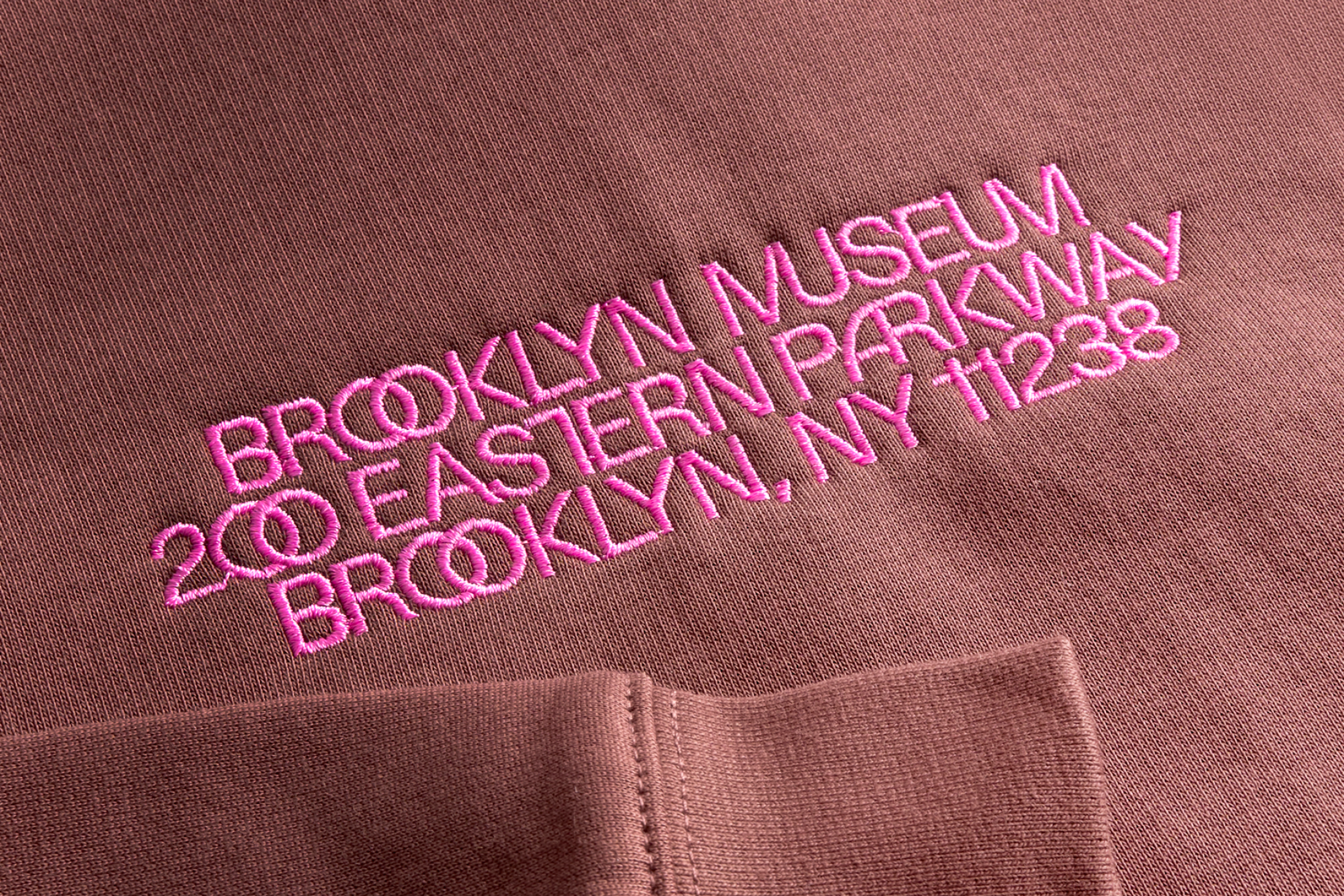
Three gray values in the new brand similarly pay homage to our limestone building. But you’ll likely notice the other hues. We’ve embraced a brighter, more saturated version of a standard color wheel—a full palette with a distinctly Brooklyn vibe.
The two dots, overlapping letters, and kaleidoscopic colors all convey the Museum’s identity as more than a single location, a single point in space, or a single perspective. We are a place where a multiplicity of ideas, identities, and points of origin converge. The design elements nod to the awesome array of artworks within our collection, as well as the many interconnected roles we are proud to play for our multifaceted public: art museum, educational center, forum for ideas, and weekend hotspot, to name a few.


Fostering creativity and flexibility
The new brand places creativity at its core, enabling us to truly reflect the rich diversity of artists whose work graces our galleries. Our design language is clear and distinct while remaining adaptable, so that every interaction with our audiences is both unmistakable and innovative. Brooklyn is a blend of tradition and innovation, and our brand is designed to honor that legacy while constantly evolving to meet the moment.
And we’re just getting started
We’re proud to share a brand as iconic as our institution, one that will stand the test of time and continue to break the mold. Check back throughout our 200th anniversary celebrations as we roll out additional aspects of the identity. Our new website is in the works, and our Shop will feature even more exciting ways to showcase everything that the Brooklyn Museum—and Brooklyn itself—represents.
We are grateful to our incredible design partner, Other Means, for their deep care and thoughtful approach to developing this identity in collaboration with our in-house graphic design team. This work is built on the foundations of our brand strategy, developed with SYPartners.
Sofie Andersen is Chief Marketing and Experience Officer at the Brooklyn Museum. All photos by Adrianna Glaviano.